
How might we enable job seekers to save and organize the information they need throughout their journey and into the offer stage?
Collections is a new product feature on the Glassdoor app that allows job seekers to collect and organize job listings, company review highlights, interview questions, and typical salary data to reference throughout their job search. Users can easily reference what they collect when they need it, and create notes as they go.
The Team
Me - Lead and sole designer
1 Product Manager
1 Researcher
3 iOS engineers
3 Android engineers
My Role
As lead designer on the Native Apps team, I worked with PM to identify pain points in a job seeker’s journey, then led a design sprint to explore, validate, and test solutions. Next was collaborating with engineering in order to build. We developed a plan to release Collections as the first phase of an overall strategy, then release job-tracking features separately as a second phase.
After validating the overall structure of the feature, I worked with components from our team’s design system in order to maintain a consistent visual language, move more quickly through the visual stage, and to streamline engineering’s workload with reusable components. I worked through final stages and QA with engineering, as we brought the product to a phase one launch.
Success Metrics
Primary:
Visits/Unique User
Product Specific:
% of users in the app that have a collection
% of users who engage with new Saved tab
Apply-starts/Unique User
Research
Job seekers utilize multiple tools on numerous platforms to keep track of jobs and research, take notes, and stay organized.
Prior to starting Collections, my team conducted a survey study with Glassdoor users about how they use our mobile products and what their expectations are. 20% of participants in the study responded that they mainly downloaded the app to organize their job search, though that was not yet a feature or focus available in the app at the time. The survey showed that most users use Excel, Email, and Google Docs to organize and manage their job search, done across multiple products and platforms. Job seekers are using different products for different phases and purposes in their journey. Some even mentioned taking screenshots of job descriptions in order to reference in their photos later.
It was clear that organization and focus throughout a job search was a pain point for users, and there was an opportunity to explore solutions that would simplify and streamline this part of the job seeking process.
Problem
Research is a carefully considered phase for job seekers. Organizing that research, remembering details, and keeping notes throughout a job search and into the interview phase is a pain point for job seekers, regardless of platform.
Opportunity
Create a unified experience for job seekers to better manage their job search, research, and notes. Seamlessly integrate saved jobs with review content, interview questions, and salary data that the user finds helpful and relevant in their research.
Ideate - Design Sprint
After identifying a broad pain point and seeing an opportunity to solve for it, we wanted to dig deeper to better understand the problem and brainstorm how a solution could fit into the overall product. The mobile native team’s product manager and myself set up a five-day design sprint to ideate solutions in detail and how we would go about testing and executing them.
Day 1, What are we trying to accomplish?
We wanted to finish the sprint with solid foundational explorations, and a simple prototype to test with selected participants. This would help us learn if our concepts are helping to solve the stated problem and make research and organization easier for jobs seekers.
Key Questions
At what point of the job seeker user journey is this most useful?
What types of collections will users make?
How do we solve for the “black box” issue and application tracking? That is, how do we help clarify to a user where their application goes after applying to a job?
Can we help users define the type of job or career they’re interested in?

Day 2, How can we solve for our users’s needs?
We took our previous research findings, and began prioritizing key events and actions that happen within a job seeker’s overall user journey, based on four personas defined in prior research. We aimed to discover where a focus around organization and research makes the most sense and when it is the most valuable. We thought about existing ideas within the Glassdoor platform and how we could leverage these as a starting point, while also taking stock of similar ideas within other products. We took time in the afternoon to begin sketching out ideas for solutions.
The four personas we’re collectively designing for:
High affinity: Gainfully employed, but open to a better fit
Growth: Looking for room to grow; different challenge, more compensation
Balance: Overworked; looking for better work/life balance
Insecure: Unemployed or about to be
‘Growth’ persona - Click to enlarge
‘Balance’ Persona - Click to enlarge

Brainstorming research & organization opportunities at various stages of the journey
Day 3, Solidify the solution, fit it into our product system
On day 3, we brought in peers from design and engineering to discuss our goals and solution in a more broad product sense, and to discuss any potential engineering roadblocks. We looked at how our proposed solution fits into the overall journey for a Glassdoor user regardless of platform, and how they might tie it in to work with other tools available to them.
Though the product feature was proposed to launch first on the native app, we discussed a future version on web and mWeb platforms that maintains a cohesive product experience. By gaining this clarity through our conversations, we were able to start formulating an idea of what the prototype would look like.

Our over-arching Job-Seeker Journey
Day 4, Build a prototype
On day 4, I began distilling our explorations and product ideas into a functional prototype that we could test with participants on our last day.

Before applying, users often prefer to save a job, and go through a phase of research, preparation, and consideration before taking the plunge, unlike a simple purchase flow.

A collection is made up of four types of content: jobs, salary data, reviews, and interview questions. Each type of content can be saved into a collection at any point in the experience.
Saving jobs, salary data, reviews, and interview questions all into one collection could potentially make for quite a large artifact of content. I wanted users to have an easy way to sift through the types of content they saved in order to reference it quickly. We tested two versions of the Collection view: one grouped by tabs, the other showing all content groups inline. To my surprise, most participants preferred the long inline list view. Most thought a simple scroll interaction from top to bottom was simpler than navigating through sorted tabs, despite the potentially long page length.
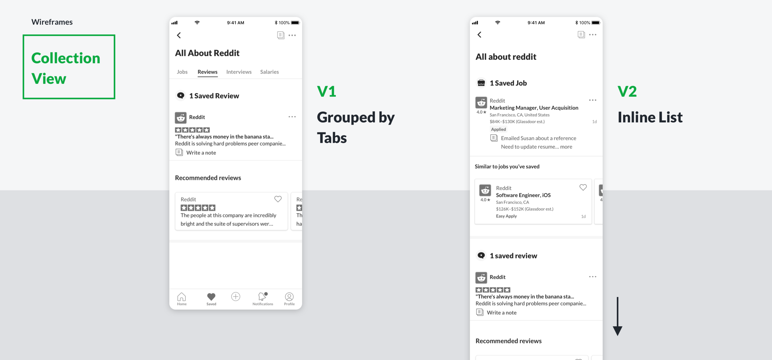
Two layouts were tested for the Collection view (viewing the collection after saving items to it)
V1: Saved content is grouped by tabs.
V2: Saved content is all shown inline as a scrolling list, with anchored headers as the user scrolls.
Day 5, Test
We first tested internally with new-hires to validate their recent job search experience against a few approaches we had, and to work out any kinks. We iterated on the structure and navigation a bit, and prepared the prototype for external, moderated testing.
What We Learned in Testing
The feature was seen as a highly valuable organizational tool.
Collections: The ability to save jobs into groupings was highly valued as a useful way to organize the research phase of the job search before applications are submitted. Participants also had a high interest in the ability to save interview questions found in their search, so they could study up and have a bit of a ‘cheat sheet’ on interview day.
Notes: The option to save “freeform” notes at both the job level and collection level was considered to be very useful.
Suggested Content: All users reacted positively to the inclusion of suggested content, especially ‘Related jobs,’ but many indicated that the ‘Related interview questions’ would not be needed until after they applied for a job. In the end, we decided context and relevance were key, and focused efforts on suggesting the right item at the right time.
Usability and a compromise: Collections were easy to find in navigation, though ‘Viewed Jobs’ were forced into an awkward place. In exploring alternative layouts, an ideal solution would have been more complex, so we had to weigh engineering effort against user needs for a first launch. We decided to solve the overall navigation structure upon releasing the second phase of our organization product.
Next Steps
The product feature resonated with participants in moderated testing and was seen as very useful. We had tested and discussed with participants some features related to keeping track of their application process and organizing interviews, but decided to scope these into a second phase.
We aligned with engineering to scope out a first launch, as I iterated on a few design points.
Launch
We launched an initial A/B test to 5% of our iOS users and 5% of our Android users and saw strong engagement. Analyzing metrics and watching for bugs, we eventually rolled out to 100%, and over time, started seeing a large lift in retention.

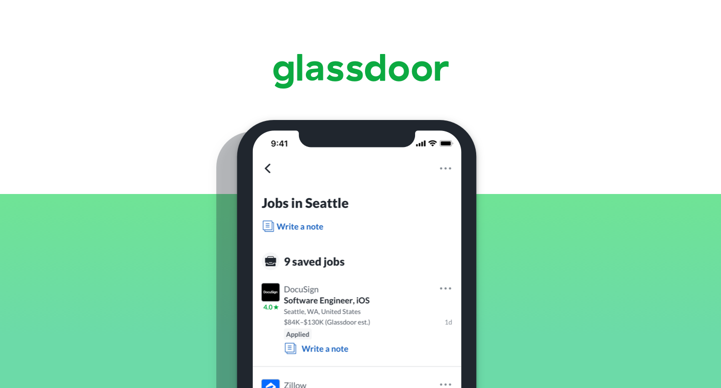
Users can save a job into a collection, along with interview questions, company reviews, and salaries

Users’ collections are all stored in the Saved tab. Tapping one brings them into the collection view, and includes the ability to write and store notes.
Looking Forward
As we’ve seen the feature resonate with users in both numbers and actual feedback, we’re working on ways to improve and streamline navigation, and how to better integrate the feature into an updated content UI.
Additionally, I’m working on designs for a web version so that users will have a seamless experience saving and referencing the items they find helpful on the platform that suits them best.
Impact
Visits/UU
+2.7% on iOS
+2.1% on Android
Job Visits
Neutral on iOS
+1.2% on Android
9.5%
of users have created at least one collection
In the first three months after launch, we saw over 327k collections created, and almost 1.2M items saved to those collections. That’s 3.64 items per collection, which means users are engaged.